
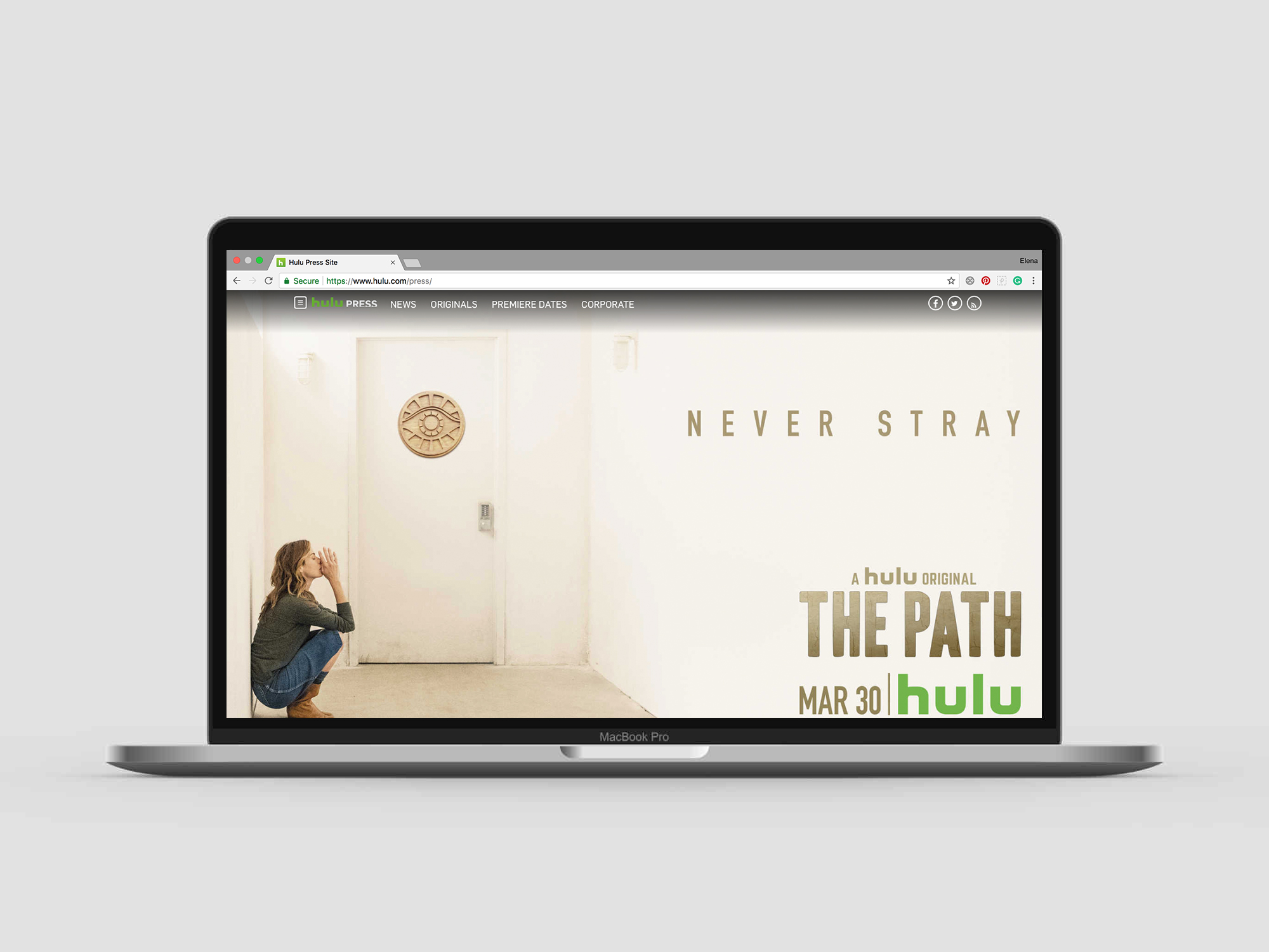
Hulu Press Site
The Hulu Press site's main audience consists of press and media partners who use it to gain access to the latest press releases and information about new content on the go.
The goal in the redesign was to not only create a site that was responsive and mobile friendly, but have templated layouts that easily allow for content to be updated and added as the platform continued to grow. Since hulu.com already had an existing press site and existing corporate pages, a unique aspect of this project was to leverage as many of the current pages as possible (as to not create more dev work than necessary) while adding pages that carefully took into consideration the most important use cases.
Note: Since the site went live, Hulu went through a rebrand, therefore the current site has been updated accordingly.
Homepage & Masthead- Before / After


The original masthead carousel did not allow the user to click through to show pages. Since we knew the audience leveraged press sites for items like synopses, cast info & imagery, we updated the masthead carousel to showcase four containers at once. This allowed Hulu to display more content immediately and enabled press to access information faster.
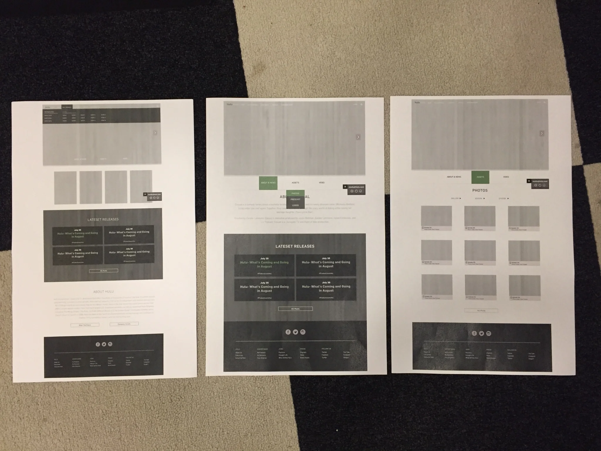
Homepage redesign (early exploration)

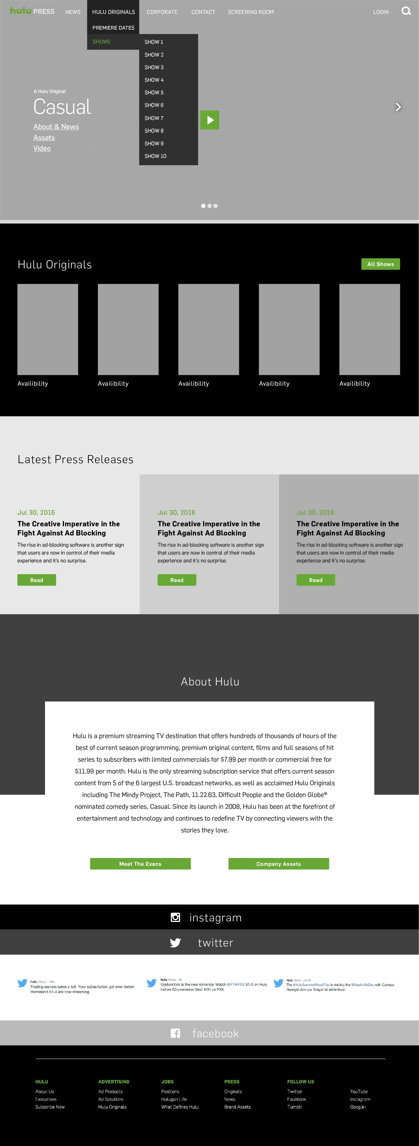

As compared to the original homepage (left), I explored variations (middle & right) that took the most useful information for the user (like show tiles, blog and Hulu's description) and showcased more of it up front.
Show page Wireframe & Flow


Show pages were a critical part of the redesign and the main challenge was to display a large amount of information in a digestible manner. After narrowing down the most important content (cast bios, images, & synopses), I decided to create a sub-navigation that bucketed the content into categories. This sub nav would act as a toggle to reveal content without making the user leave the main page. These show pages were thoughtfully designed with the user in mind, down to including a 'copy' link within each text module since we knew they were often on the go.


Early sketches of show pages showing an exploration in a side navigation that we ultimately decided would compete too much with content on the page. We ended up simplifying it and moving it just under the header image.
Login Module

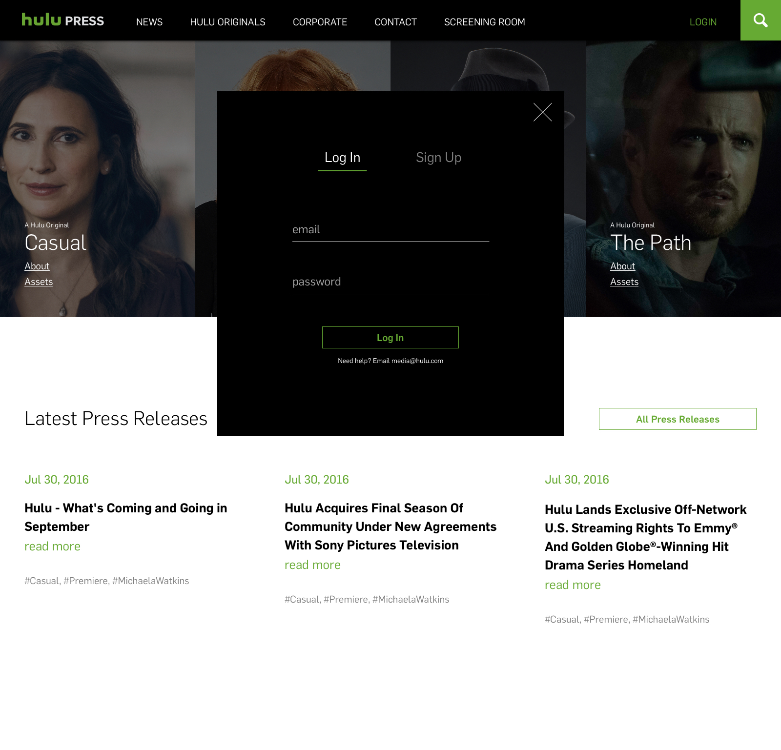

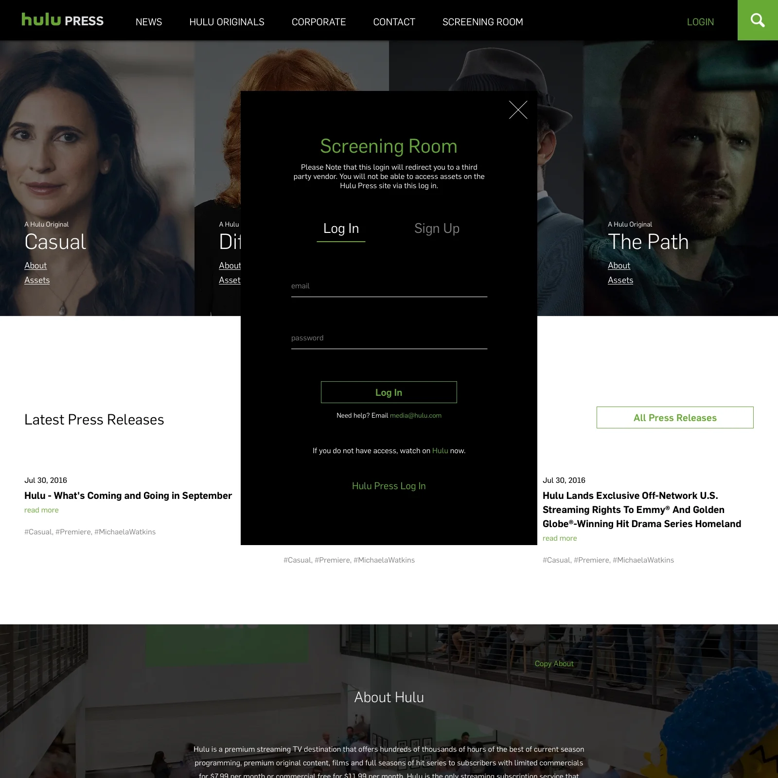

A unique challenge was that two types of assets (photos & screeners) needed to be password protected but were housed on two different websites. This created the need for multiple logins. Keeping the user in mind, my first instinct was to explore combining the two into one login module (above). However, given the constrained time and dev resources we had to solve for two separate logins. Therefore we landed on creating a main login link which allowed users access to all content housed on the press site (like episodic stills & show assets like key art), while creating a separate link in the main navigation called 'screening room' which was designed with an arrow to indicate that the user would be leaving the site, prompting a separate login (right image above).
Mobile Prototype
Prototype showing mobile navigation flow from homepage to show content & homepage to blog content.
Critique


Printed wireframes to compare and critique. It was here that my art director and I reviewed user flow and discuss changes. We'd sometimes we used this time to choose an aesthetic as we evolved into higher fidelity mocks. Using printed mockups helped with cohesion, discussion and taking notes.